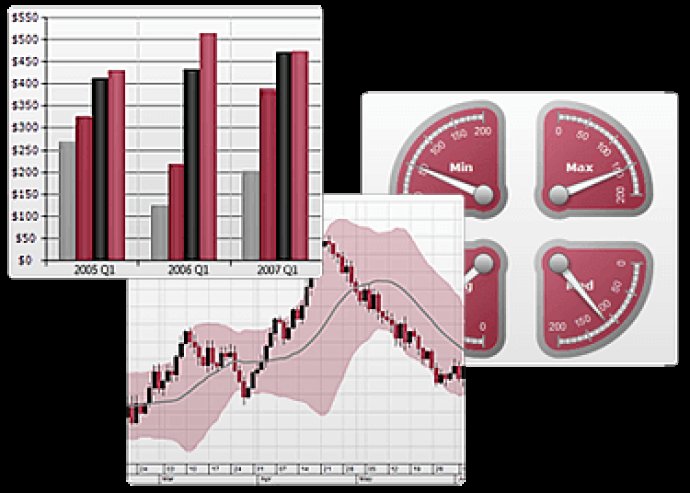
Nevron Data Visualization for Microsoft SharePoint offers reporting and dashboarding capabilities to users and IT professionals in SharePoint, empowering them with exceptional visualization technology.

This all-in-one solution, Nevron SharePoint Vision, is perfect for anyone who wants to create advanced digital dashboards and reports on time and within budget. The Nevron Chart for SharePoint is an advanced web part that provides an extensive range of 2D and 3D chart types, customizable axes, several charting areas, legends and titles, and a full range of enterprise charting features that are driven by pivot data aggregation. Best of all, complex pivot charts can be created visually and directly within the SharePoint environment.
The Nevron Gauge for SharePoint offers a complete set of radial and linear gauges, numeric displays, and state indicators. Users can easily modify complex gauges that are tightly integrated with their data, all done visually and directly within the SharePoint environment. Nevron Map for SharePoint is designed to create choropleth maps that are integrated with your data. The web part comes with an unmatched set of features related to visual quality, layout, data integration, and data analysis. Lastly, the Nevron Barcode for SharePoint delivers impressive data-driven linear and matrix barcodes.
In summary, Nevron Data Visualization technology is an excellent choice for individuals and IT professionals who want to create advanced reports and dashboards within the SharePoint environment. The web parts included in the suite are both reliable and flexible, making this a go-to choice for those who need to analyze data in-depth.
Version 2022.1: Enhancements to chart for SharePoint, bug fixes and new features.